Over the past 4 months we’ve been working with branding specialists Rose, the creative minds behind Sound and Music’s brand identity, to give Music Patron a unique identity of its own. With the new site launching today, we wanted to share the process we went through to arrive at this huge milestone.
Joy. Authenticity. Trust. Playfulness. Connection. These Music Patron’s values. We chose these 5 words as we feel they are the essence of Music Patron and have steered every decision we’ve made along the way. We provided these values to Rose and gave them the huge task of creating a unique identity for Music Patron based on them.
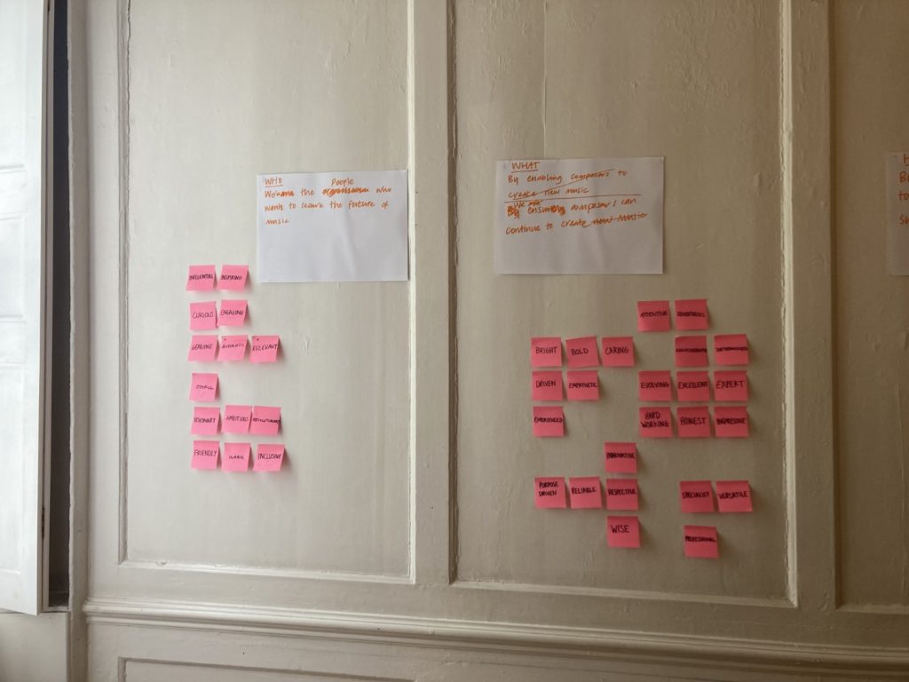
We began our journey by visiting Rose at their headquarters in London. Our first step was finding the mission statement for Music Patron; how do we make it clear what we do to potential patrons? We filled a wall with post-it notes containing our favourite words to describe Music Patron and, after a good few hours, landed on this:
We are the people who want to secure the future of music. We enable composers to continue to create by inviting music lovers to connect with and truly support them.

We left feeling energised and inspired. To have this mission statement felt like a solid foundation on which to build the rest of the Music Patron identity.
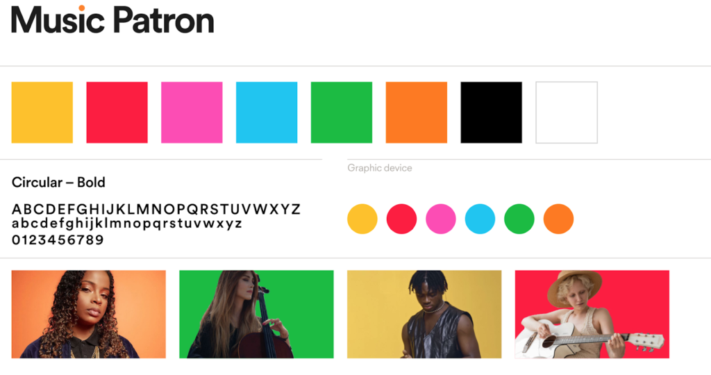
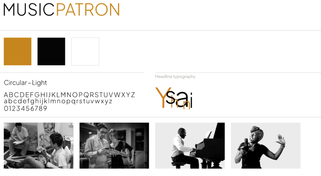
The next step was for Rose to create some initial creative directions for us to choose between. They came back with two very distinct options: the first was modern, playful and colourful featuring lots of dots. The second was more sophisticated looking, mostly black and white with gold accents, something you might see from a membership-based company like American Express.


We consulted patrons, composers and the wider Sound and Music team. In the end, we chose the former as we felt it brought together our values, particularly ‘Joy’ and ‘Playfulness’ in a much more comprehensive way. We also felt that the second design might suggest a certain type of patron we’re looking for, whereas we strongly believe anyone can be a patron.
Although we went with the first creative direction, there were elements we really loved about the second. The black and white photography choices that showed people being ‘in the room where it happens’ with composers and artists really jumped out to us, it’s exactly what we want our patrons to feel. With this in mind, we chose to implement some of these black and white photography elements into the design.
Finally, it was important to us and Rose that Music Patron bear a ‘family resemblance’ to Sound and Music. We wanted to push our colour palette in the direction of theirs, to something a little cooler but still retaining the playful vibrance of the first design.
What we landed on is the identity you can see today! We’re so pleased with the final design and feel like it perfectly encapsulates all of our values as well as being instantly recognisable as a Sound and Music relative.